
Tableau has become a data visualization tool that allows users to create meaningful and interactive dashboards that bring data to life. Whether you’re a data analyst, business intelligence professional, or anyone looking to effectively visualize data, mastering Tableau can greatly improve your ability to clearly communicate complex data sets.
In this article, we’ll explore various tips and tricks to get the most out of Tableau for data visualization. From designing visually appealing dashboards to using advanced features for deeper insights, these tips will help you take your Tableau skills to the next level.
Whether you’re new to Tableau or looking to improve your skills, this article will provide you with valuable insights and techniques to help you create compelling visualizations that drive better decisions and business results.
“Data is the new oil. It’s valuable, but if unrefined it cannot really be used. It has to be changed into gas, plastic, chemicals, etc. to create a valuable entity that drives profitable activity; so must data be broken down, analyzed for it to have value.” – Clive Humby
Importance of effective data visualization in Tableau
Effective data visualization is crucial for gaining insights and making informed decisions. Tableau empowers users to transform raw data into compelling visualizations that are easy to interpret and share with stakeholders. By presenting data in a visually appealing manner, Tableau helps uncover patterns, trends, and outliers that may otherwise go unnoticed, leading to more informed decision-making processes.
Getting Started with Tableau
Installation and setup tips
Before diving into Tableau, it’s essential to ensure smooth installation and setup. Users should download the appropriate version of Tableau Desktop based on their operating system. During installation, it’s advisable to pay attention to system requirements and follow the prompts carefully. Additionally, exploring Tableau’s online resources, such as tutorials and forums, can provide valuable guidance for setting up the software.
Understanding Tableau interface
Tableau’s interface is designed to be intuitive and user-friendly. Upon launching Tableau Desktop, users are greeted with a workspace consisting of various panes and menus. Understanding the purpose of each component, such as data connections, shelves, and cards, is essential for efficient navigation and usage. Tableau’s drag-and-drop functionality simplifies the process of creating visualizations, allowing users to focus on analyzing data rather than struggling with the software’s interface.
Data Preparation
Best practices for data formatting
Data formatting is a critical step in the data preparation process. Tableau works best with well-structured, clean data. Users should pay attention to data types, ensuring that numeric values are correctly formatted, and dates are standardized. Additionally, addressing missing or inconsistent data values is essential for accurate analysis and visualization.
Data blending techniques
In scenarios where data is sourced from multiple datasets, data blending allows users to combine information from different sources seamlessly. Understanding how to establish relationships between datasets and leverage Tableau’s blending capabilities can enhance the depth and breadth of analysis. However, users should exercise caution to ensure data integrity and avoid inaccuracies during the blending process.
Visualization Design
Choosing the right chart types
Tableau offers a wide range of chart types to visualize various types of data effectively. Selecting the appropriate chart type based on the nature of the data and the insights to be conveyed is crucial. Whether it’s bar charts, line graphs, scatter plots, or heatmaps, each chart type has its strengths and limitations. Experimenting with different chart types and understanding their applications can help users create more impactful visualizations.
Color usage and formatting tips
Color plays a significant role in data visualization, aiding in distinguishing between data categories, highlighting trends, and adding visual appeal. Tableau provides options for customizing colors, gradients, and palettes to suit specific preferences and branding requirements. However, it’s essential to use color judiciously to avoid overwhelming the viewer and ensure accessibility for individuals with color vision deficiencies.
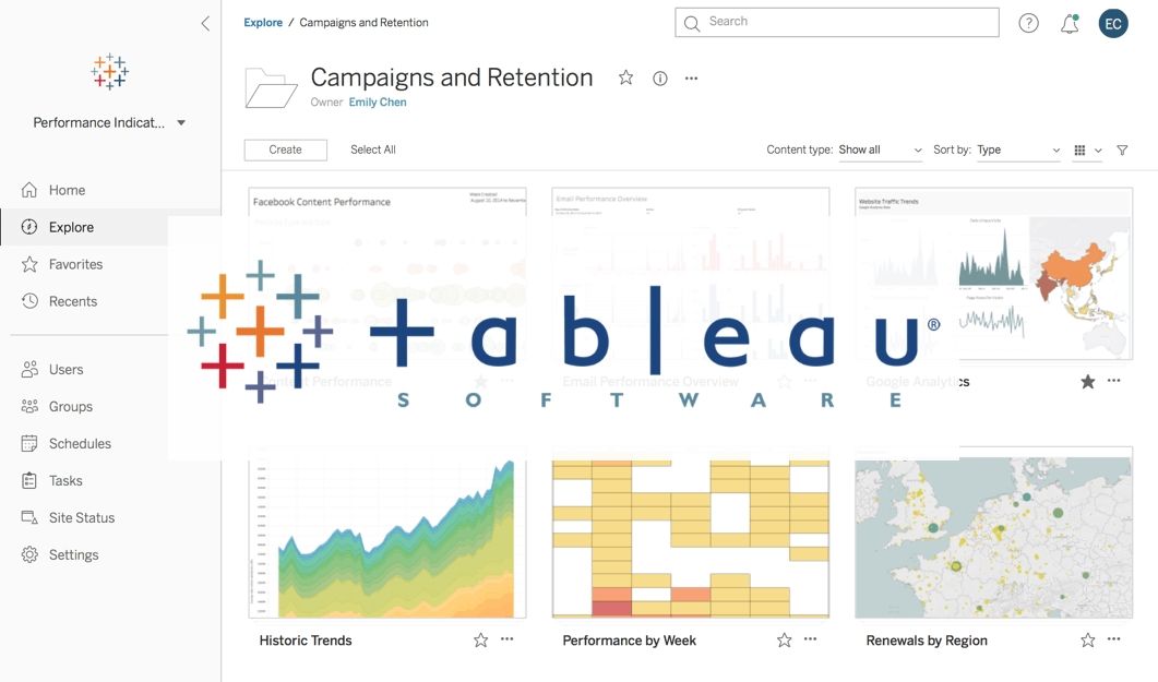
Creating interactive dashboards
Interactive dashboards in Tableau allow users to explore data dynamically and uncover insights on the fly. Incorporating interactivity features such as filters, parameters, and actions enhances the user experience and facilitates deeper exploration of data. By designing interactive dashboards, users can empower stakeholders to interact with data intuitively, leading to more meaningful insights and decisions.
Advanced Features and Techniques
Calculated fields and parameters
Calculated fields and parameters enable users to perform complex calculations and customize visualizations according to specific requirements. Whether it’s creating calculated measures, defining filters, or setting dynamic thresholds, understanding how to leverage calculated fields and parameters expands Tableau’s analytical capabilities. With practice and experimentation, users can unlock the full potential of these advanced features to address diverse analytical challenges.
Using Tableau functions effectively
Tableau offers a rich library of functions for manipulating and analyzing data. From basic arithmetic operations to advanced statistical functions, users can leverage Tableau’s functions to derive insights and perform sophisticated analyses. Familiarizing oneself with commonly used functions and exploring their applications in real-world scenarios equips users with the skills to tackle complex analytical tasks with confidence.
Incorporating geographic data and maps
Geographic data visualization is a powerful feature of Tableau, allowing users to map data points and analyze spatial patterns effectively. Tableau’s mapping capabilities support various map types, including choropleth maps, point maps, and heat maps. By incorporating geographic data into visualizations, users can uncover geographic trends, identify regional disparities, and gain geographical insights that drive informed decision-making.
Performance Optimization
Tips for improving dashboard performance
Optimizing dashboard performance is essential for delivering a seamless user experience and ensuring responsiveness, particularly when dealing with large datasets or complex visualizations. Strategies such as limiting the use of live connections, optimizing data extracts, and simplifying calculations can help improve dashboard loading times and enhance overall performance. By implementing performance optimization techniques, users can deliver high-quality dashboards that meet the needs of stakeholders efficiently.
Data source optimization techniques
Efficient data source management is critical for maximizing Tableau’s performance and scalability. Users should adopt best practices for data source optimization, such as optimizing database queries, reducing data redundancy, and leveraging data extracts effectively. Additionally, regularly monitoring data source performance and identifying bottlenecks ensures smooth data access and analysis within Tableau.
Also Read: Harnessing Business Insights with Microsoft Power BI
Collaboration and Sharing
Publishing visualizations to Tableau Server or Tableau Public
Tableau provides options for sharing visualizations with a broader audience through Tableau Server or Tableau Public. Tableau Server offers secure, centralized hosting for sharing visualizations within organizations, facilitating collaboration and data governance. On the other hand, Tableau Public provides a platform for sharing interactive visualizations publicly, enabling users to showcase their work and engage with the Tableau community.
Collaborative features and sharing best practices
Tableau’s collaborative features enable users to collaborate effectively on data visualization projects, whether it’s co-authoring dashboards, sharing insights, or providing feedback. Leveraging features such as commenting, version history, and permissions management streamlines collaboration and fosters a culture of knowledge sharing. By embracing collaborative workflows and sharing best practices, users can leverage the collective expertise of their team and produce higher-quality visualizations.
Tips for Troubleshooting and Problem-Solving
Common issues and their solutions
Encountering challenges and issues is inevitable when working with Tableau. Common issues such as data connectivity issues, performance bottlenecks, or unexpected behavior may arise during the data visualization process. Understanding the root causes of these issues and troubleshooting them effectively requires a systematic approach and familiarity with Tableau’s troubleshooting tools and resources.
Utilizing Tableau community resources
The Tableau community is a valuable resource for users seeking assistance, advice, and solutions to Tableau-related challenges. From online forums and user groups to knowledge bases and documentation, Tableau provides a wealth of resources for troubleshooting and problem-solving. Engaging with the Tableau community, participating in discussions, and sharing experiences fosters learning and collaboration, ultimately empowering users to overcome obstacles and excel in their Tableau journey.
Best Practices for Data Visualization Projects
Data storytelling tips
Effective data storytelling involves crafting narratives that resonate with the audience and drive action. Incorporating storytelling elements such as context, empathy, and a clear narrative arc enhances the impact of data visualizations and facilitates better understanding and decision-making. By weaving data into compelling stories, users can communicate insights effectively and inspire meaningful change.
Ensuring accessibility and usability
Designing data visualizations with accessibility in mind ensures inclusivity and enables a wider audience to engage with the insights presented. Incorporating features such as alternative text for images, accessible color palettes, and keyboard navigation enhances usability for individuals with disabilities. By prioritizing accessibility, users can create inclusive data visualizations that cater to diverse audiences and promote equal access to information.
Conclusion
Throughout this guide, we’ve explored various tips and tricks for leveraging Tableau effectively to create impactful data visualizations. From data preparation and visualization design to advanced features and collaboration, mastering Tableau requires a combination of technical skills, creativity, and attention to detail. By applying the insights gained from this guide, users can unlock the full potential of Tableau and transform data into actionable insights that drive informed decision-making.
Encouragement for continued exploration and learning in Tableau
As Tableau continues to evolve and innovate, there’s always something new to learn and explore. Whether it’s mastering advanced features, experimenting with cutting-edge visualization techniques, or staying updated on the latest industry trends, continuous learning is essential for staying ahead in the field of data analytics. By embracing a growth mindset and seizing opportunities for learning and development, users can embark on a rewarding journey of discovery and mastery in Tableau.
FAQ
Q: Can Tableau handle big data?
Yes, Tableau has features like data extracts and live connections that allow it to handle large datasets efficiently. Additionally, Tableau’s scalability enables it to process and visualize big data effectively.
Q: Is Tableau suitable for beginners?
Absolutely! Tableau’s intuitive interface and drag-and-drop functionality make it accessible to beginners. There are also plenty of tutorials and resources available to help beginners get started with Tableau.
Q: Can I customize the appearance of my Tableau visualizations?
Yes, Tableau provides extensive customization options for visualizations, including formatting colors, fonts, labels, and backgrounds. Users can tailor the appearance of their visualizations to match their branding or personal preferences.
Q: How can I share my Tableau visualizations with others?
Tableau offers multiple options for sharing visualizations, including Tableau Server for internal sharing within organizations and Tableau Public for public sharing. Users can also export visualizations as images or PDFs for offline distribution.


